Short on time? Click here for the TL;DR
Percent positivity (positive tests / total tests * 100%) is so important because it summarizes two signals in one number: outbreak size and the adequacy of testing. A growing outbreak or insufficient testing (or both) will cause percent positivity to rise.
Trying to compare percent positivity over time is more difficult when the underlying population being tested changes over time. Examples in Ontario, Canada include the switch to appointment-based testing, suspension of contact tracing and changing criteria for testing.
Ontario initially proposed 10% positivity as a threshold for category “red” restrictions. However, 10% positivity is indicative of uncontrolled, exponential growth, as demonstrated by the experience of Europe and the United States during the second wave of the pandemic.
We must not wait until 10% positivity to act. The rapid deterioration of the COVID-19 situation in Manitoba shows that every city and province in Canada is still vulnerable to the pandemic. We must respond proactively and decisively to avoid serious societal consequences.
Percent positivity
While it may be the daily case numbers that grab the headlines, it’s far from the most important metric to watch when determining the trajectory of COVID-19, as I’ve written before. Instead, we should be focusing on other metrics, like the 7-day rolling average, the number of outbreaks in long-term care facilities and percent positivity.
What makes percent positivity in particular such a useful metric is that it summarizes two distinct signals in a single number. The definition of percent positivity is simple: the number of positive tests (numerator) divided by the total number of test results reported (denominator), expressed as a percentage.
What affects percent positivity?
Assuming the underlying population being tested remains constant, there are two ways for percent positivity to increase: if positive tests increase (numerator) or total tests decrease (denominator). Thus, a rising positivity rate signals either a growing outbreak or insufficient testing (or more likely, both). Since insufficient testing directly impacts our ability to isolate cases, identify contacts and break chains of transmission, both situations should raise alarm bells.
Put another way, we should expect percent positivity to remain constant over time if and only if:
- The fraction of new cases detected and reported is constant.
- The number of tests scales with the true number of new cases.
But what if our original assumption is wrong? What if the underlying population being tested does change over time? Let’s look at three recent examples of this from the Canadian province of Ontario.
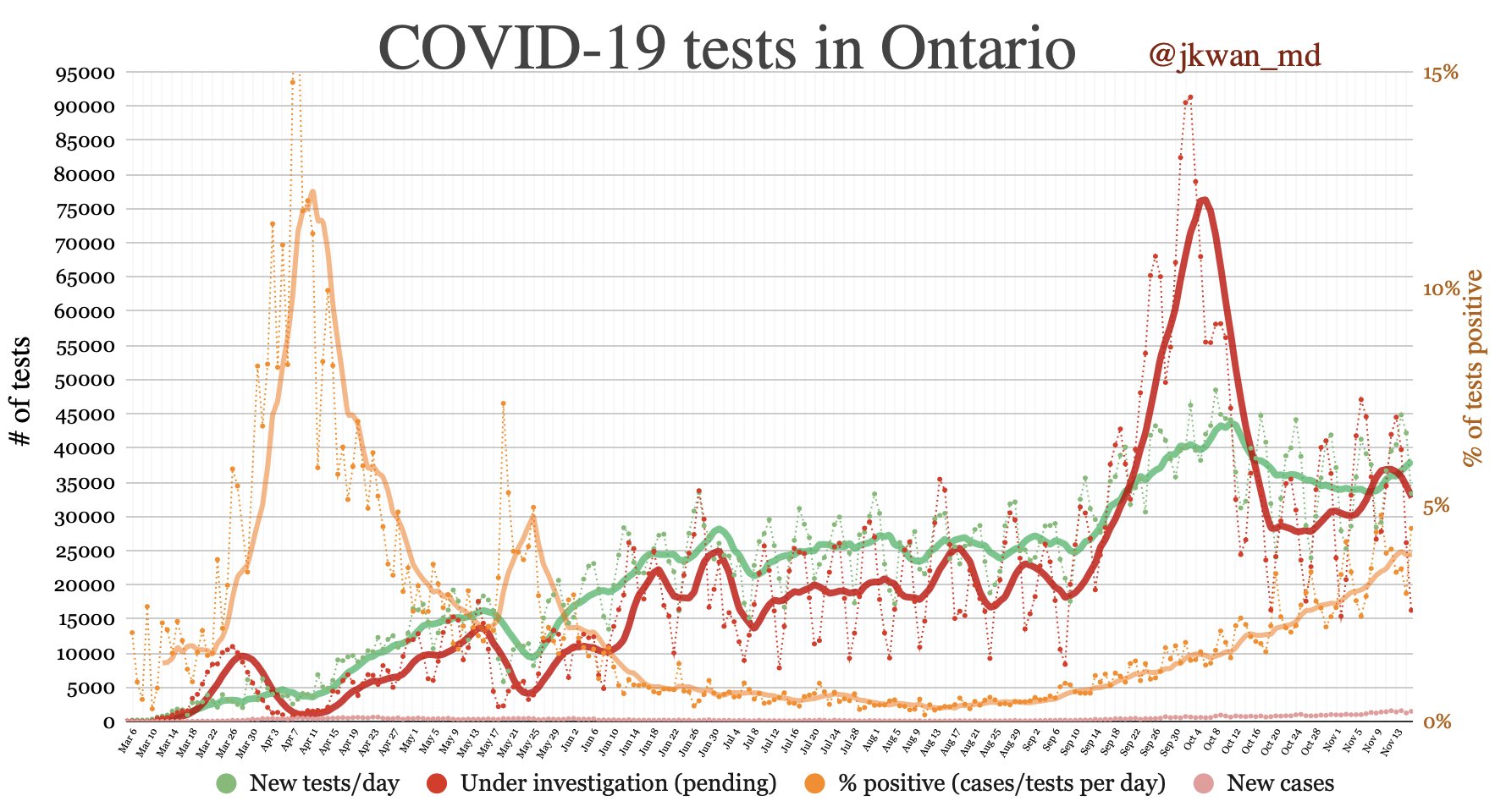
The first is the switch from walk-in testing to appointment-based testing at the beginning of October. The populations getting tested under these two regimes are almost certainly different. However, it is difficult to predict the effect on percent positivity, only that comparing before and after is somewhat apples to oranges.
The second is the suspension of contact tracing in Toronto. This leads to a smaller fraction of cases being detected (particularly asymptomatic cases), but it also means fewer people without symptoms will be prompted to get tested. So again, it’s hard to predict the effect of this change on percent positivity.
The final change is the tightening of testing criteria in response to a massive testing bottleneck to discourage low-risk asymptomatic individuals from seeking tests. This move likely raised percent positivity—which is actually a good thing. Given a fixed testing capacity, your testing strategy should aim to maximize percent positivity, because this means you are capturing the highest possible fraction of cases.
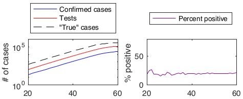
We can illustrate this principle with an extreme example. Suppose you have the capacity to run 100 tests per day. Normally, you would choose who to test based on symptoms and/or exposure history. If you instead tested people at random, you would end up with a lower percent positivity. A higher percent positivity means you are capturing a higher fraction of cases with your limited testing capacity. This is why the interpretation of changes in percent positivity over time is only straightforward if the underlying population being tested remains roughly the same.
Thresholds
Why is percent positivity front of mind for me right now? In early November, the Ontario government unveiled a five category, colour-coded COVID-19 response framework based on a series of metrics including the daily case rate, health system capacity and contact tracing ability.
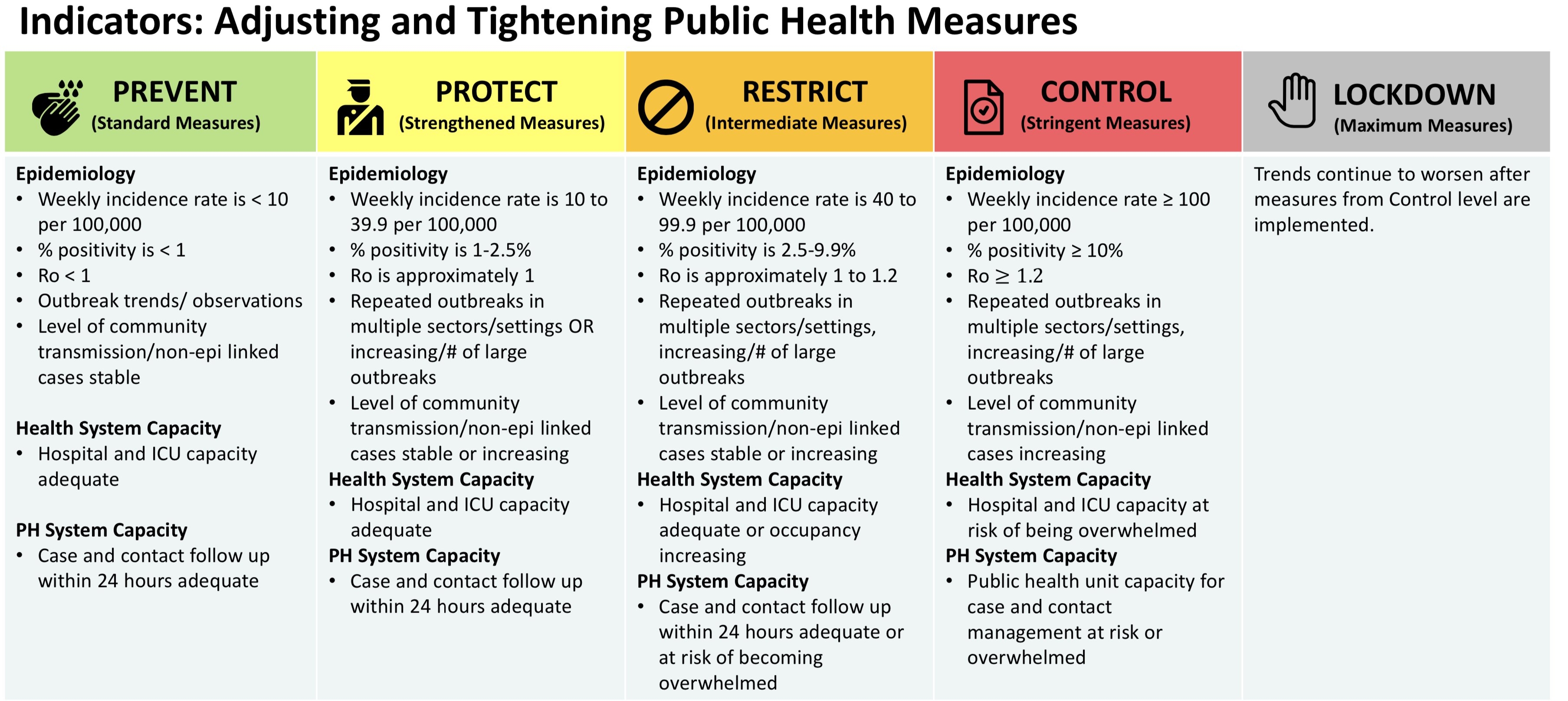
While the idea of a transparent, predictable response framework based on sensible metrics is a good one, I along with many other experts expressed surprise at the thresholds used in the response framework, as well as the accompanying responses.
One of the most shocking elements was the 10% positivity threshold for the red “control” category. A 10% positivity rate indicates an out-of-control epidemic or woefully inadequate testing (or both), especially during cold/flu season when the demand for testing will increase due to respiratory symptoms from non-COVID respiratory tract infections.
When you reach 10% positivity, it’s far too late to act to prevent serious consequences.
Why we don’t have to wait
There’s no reason to wait to see if this theory bears out in Ontario. Here in Canada, heading deeper into autumn and winter, we have a crystal ball to see the future if we don’t act quickly and decisively to keep positivity rates dramatically below 10%. That crystal ball is Europe (and many parts of the United States), which for this second wave of the pandemic have been several weeks ahead of us in terms of trajectory. The threat of total health system collapse has sent several countries into severe lockdowns, and restrictions are mounting across many regions of the United States. Dr. Andrew Morris breaks down the cautionary tale of Belgium admirably in the below Twitter thread.
I will focus on 2 countries to demonstrate what happens when you take a #So1stWave approach. We will start with Belgium (pop 11.5m), using data from @OurWorldInData and Belgium's National Science Institute: https://t.co/J8LJZ2wOSJ. Here was where they were Sep 23. <4 deaths/d. pic.twitter.com/nb6k9a65Pi
— Andrew Morris (@ASPphysician) November 5, 2020
There’s no reason to expect things work differently here. Every province and every city in Canada is still vulnerable to COVID-19. There is perhaps no better illustration of this than the province of Manitoba. Up until early October, the province was relatively lightly hit by the virus. After this point, cases started exploding in Winnipeg and across the province. As of mid-November, Manitoba has by far the highest rate of COVID-19 hospitalizations per capita in the country.
According to Doctors Manitoba, Winnipeg’s test positivity first hit 10% on November 10, although it had previously hit 9.7% as early as October 30. Let’s see where these dates fall on the case and hospitalization curves. Are these really the points where we should decide to take corrective action? (Note: Cases are for Winnipeg, hospitalizations are for the whole province because I couldn’t find data for just Winnipeg)
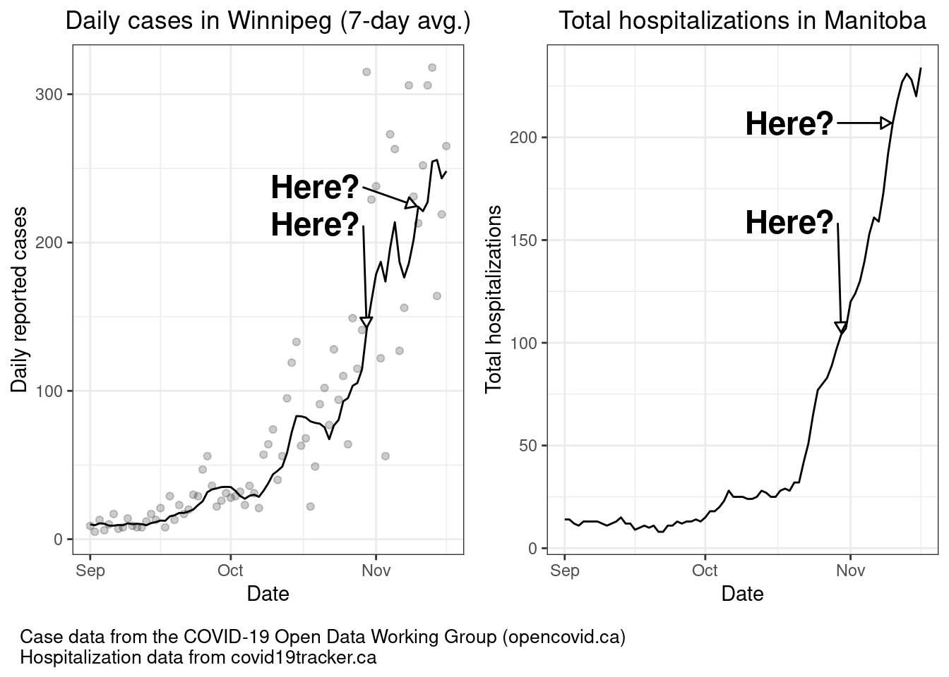
You do not wait until 10% positivity to act—you are almost certainly very deep into uncontrolled, exponential growth at this point. For the record, Winnipeg moved into shutdown on November 2, followed by the rest of the province on November 12, the day province as a whole hit an 11% positivity rate.
What’s next?
Thankfully for Ontario, it didn’t take long for the government to backtrack on the response framework and release revised thresholds, with the red “control” threshold set at a much more reasonable 2.5%. It is, at the very least, a step in the right direction.
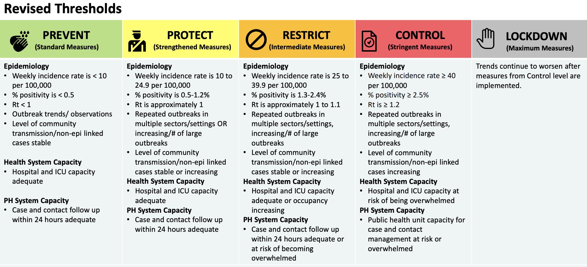
How about the rest of the thresholds in the revised framework? Well…that’s another question for another post.
You can discuss this post on Twitter.